Combination mark
Osstem Implant’s combination mark is the main symbol of the company that serves as the core of all visual communications. It is used across all media platforms Osstem Implant uses to consolidate the branding both internally and externally, and also to build a consistent corporate image.
As it is a resource that most accurately conveys the brand’s core identity, using the combination mark should take priority in media interactions, and careful attention should be paid in to make sure any application of the combination mark complies with the rules and principles stipulated for the use of the combination mark in regard to its shape and color.
Logo Package
The logo package contains the Osstem logo in three different versions (color «4C», black, and white). All logos are available in various file types to ensure maximum compatibility. Please observe the logo usage guidelines below.
Space isolation
In order to maintain the correct form of the combination mark, the minimum required space should be secured when using it. This is to maintain the brand’s identity by keeping it independent from other surrounding elements. To prevent any deformations to the combination mark, the ratio between the hight and width of the combination mark should not be altered when enlarging or reducing the size. Or the spatial requirements stipulated in this paragraph should be observed when using the combination mark.
Shrinking the combination mark beyond its minimum size requirement is prohibited to make sure it is legible to users.
Contrast Guide
To maintain brand integrity, our logo must remain clear and legible in every application. This chart illustrates the approved logo color variations for different background brightness levels, ensuring consistent visibility across all media.
As our logo is more than a mark — it’s the face of our brand. To ensure it always stands out, we adapt its colors to match the brightness of any background. This guide shows how our logo stays sharp, vibrant, and unmistakably Osstem in every setting, from bright whites to deep blacks.
Corporate color
The corporate colors are important elements that show the brand identity of Osstem Implant. They are applied to various visual media to convey the image Osstem Implant desires to communicate. Thus, it is always important to use the corporate colors in a clear and accurate manner.
Based on the colors presented in this paragraph, the corporate color scheme of Osstem Implant consists of four primary colors from the RGB and CMYK platforms for online environments, or spot colors that are Pantone colors. Corporate colors must be applied carefully to keep them consistent across different media and environments. Since colors always appear different when printed, they must be adjusted to be as close to the corporate color scheme stipulated by Osstem to maintain consistency.
C0 M75 Y100 K0
Pantone 166C
R235 G97 B0
#EB6100
C0 M0 Y0 K60
Pantone Cool Grey 8C
R137 G137 B137
#898989
Key Message
The two key messages that reflect the performance and vision of Osstem Implant can be used in slight variations of the original, along with combination image, when promoting the corporate image of Osstem Implant. They can be adapted to the local environment at overseas subsidiaries and applied according to requirements on text resources.
Let's grow together
Together has no limits
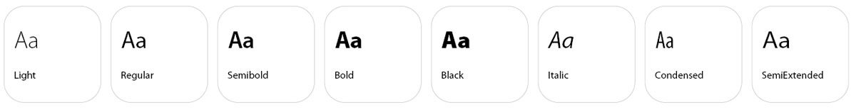
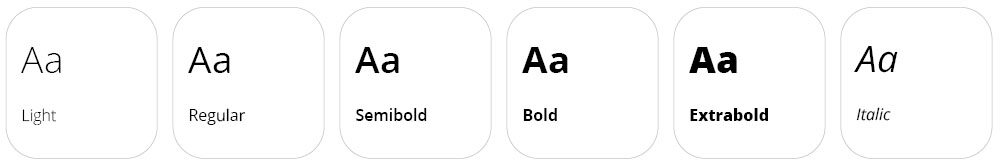
Typeface
The two key messages that reflect the performance and vision of Osstem Implant can be used in slight variations of the original, along with combination image, when promoting the corporate image of Osstem Implant. They can be adapted to the local environment at overseas subsidiaries and applied according to requirements on text resources.
Myriad Pro
Designed by:

Carol Twombly

Robert Joseph Slimbach
Myriad is a humanist sans-serif typeface designed by Robert Slimbach and Carol Twombly for Adobe Systems and was released in 1992. Myriad Pro is the OpenType version of the original Myriad font family. It first shipped in 2000, as Adobe moved towards the OpenType standard. Myriad is known for its usage by Apple Inc., replacing Apple Garamond as Apple‘s corporate font from April 29, 2002, to January 24, 2017. Myriad is easily distinguished from other sans-serif fonts due to its „y“ descender (tail) and slanting „e“ cut.
Open Sans
Designed by:

Steve Matteson
Open Sans is a humanist sans serif typeface designed by Steve Matteson, Type Director of Ascender Corp. Open Sans was designed with an upright stress, open forms and a neutral, yet friendly appearance. It was optimized for print, web, and mobile interfaces, and has excellent legibility characteristics in its letterforms.
Iconography
Icons are a powerful visual language. With the help of uniform icons, information can be transmitted quickly and effortlessly, while giving our brand a clean, modern look. Consistency is key – a cohesive style helps users instantly recognize and navigate our content.
For most applications, solid icons should be used to ensure clarity and impact. However, we also support two distinct styles: Solid and Outlined. Depending on the context, the appropriate style is chosen to maintain both visual harmony and functional clarity.